Case Study: Deploying a Holographic Glass Theater for a Commercial Complex
I would not judge a Holographic Glass Theater for a mall from the inside first.
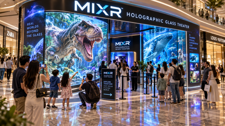
I would stand outside.
That sounds simple, but it changes the whole decision. Inside the room, everything can look controlled: the lighting, the sound, the glass bridge, the curved LED visuals, the short film. The proposal may look clean too. But a commercial complex is not a museum tour. People are half-shopping, half-waiting, half-chasing children, and very often only half-paying attention.
So the first question is not, “Does the theater look impressive?”
It is: can a family understand it while walking past with bubble tea in hand?
If not, the project will need too much help from staff and discounts later.
The Front Has to Do Some of the Selling
A mall attraction does not get much patience from visitors.
People may slow down for three seconds. Maybe five. In that short window, the front needs to say enough: this is a shared visual experience, it is safe, it will not take too long, and it is something the group can try together.
That is why I would treat the frontage as part of the attraction.
Not a signboard added at the end. Not a poster with too many words. The entrance, lighting, preview image, staff position, queue line, and ticket message all need to work together.
MIXR’s Holographic Glass Theater gives the operator several planning options, including 20, 35, 50, and 120-person configurations, with documented layout ranges around 30-200 square metres. The experience uses a glass-bridge walk-in structure, five-sided curved LED naked-eye 3D visuals, audio, control, and short film viewing.
Good. That gives the project a real product base.
But in a mall, the sale begins before anyone steps onto the glass bridge.
I’d Be Suspicious of the “Available Unit”
Every mall has spaces that look easy on paper.
A vacant unit near the back. A corner that management wants to activate. A space beside a quiet corridor. The rent may look friendly. The floor plan may seem workable.
I would still hesitate.
If visitors are not already moving near that spot, the attraction has to create its own traffic. That is expensive in a quiet, tiring way. Staff start calling people in. Campaigns become necessary. The operator begins to blame pricing, when the real problem may be location.
For this kind of product, I would rather see it near family flow: cinema traffic, food areas, children’s retail, indoor entertainment floors, or a wider walkway where people naturally slow down. It does not need to sit in the loudest place in the mall. It does need to be visible enough that curiosity can start without a staff member forcing it.
A hidden theater can still work, but then the operator should know what they are paying for: more marketing effort.
Capacity Is a Feeling, Not Just a Number
The capacity decision is where mall projects can fool themselves.
A larger room feels safer in a meeting. Nobody wants to hear that the project may be too small. But a mall attraction has to feel alive on ordinary days, not only during school holidays.
A 120-person configuration may make sense if the commercial complex has group traffic, event scheduling, or strong weekend surges. For many family entertainment floors, 35 or 50 people may feel more natural. Smaller does not always mean weaker. Sometimes it means the room feels active, staff can manage entry calmly, and visitors do not walk past a half-empty space wondering whether it is popular.
That is the detail I would watch: how the theater looks from the outside when it is not full.
In a mall, emptiness is visible. So is energy.
The Content Should Be Explainable Before the Visitor Gets Bored
I would keep the theme simple enough for a staff member to explain without sounding trained.
A space journey. A fantasy bridge. A future city. A deep-sea walk. A scenic adventure. Something clear.
The visitor does not need the full plot at the ticket counter. They need to know what kind of feeling they are buying. If the story takes too long to explain, it may be better for another venue.
MIXR’s film and CG production capability is useful here because the operator can discuss content based on the mall’s customer group. A family mall may need a different tone from a tourism commercial street or a premium lifestyle complex.
Still, I would resist making the story too clever.
In mall entertainment, clear often sells better than complicated.
I’d Build the Offer Before Opening
If this were my project, I would not open with single tickets only.
That is too thin.
The offer should already include family tickets, parent-child bundles, birthday use, holiday campaigns, and cooperation with nearby tenants. A cinema package may work in some malls. Food-and-entertainment bundles may work in others. Kids’ retail cooperation can also make sense if the floor has the right mix.
The point is not to discount randomly. The point is to give the attraction more ways to be purchased.
A Holographic Glass Theater can become a small anchor for the floor if it is packaged properly. If it sits alone and waits for walk-in tickets, the operator is leaving too much to chance.
The Version I Would Trust
The mall version I would trust is not the one with the most dramatic renderings.
It is the one that makes sense from the corridor.
A visible location. A front that explains itself. A room size that still feels active on normal weekends. Content that can be sold in one breath. Staff language that sounds natural. Packages prepared before launch.
MIXR’s Holographic Glass Theater can fit a commercial complex well because it is shared, visual, and does not ask casual visitors to wear headsets or learn game rules. That helps.
But the project only becomes convincing when people who were walking somewhere else decide to stop.
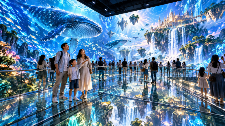
That is the mall test.